

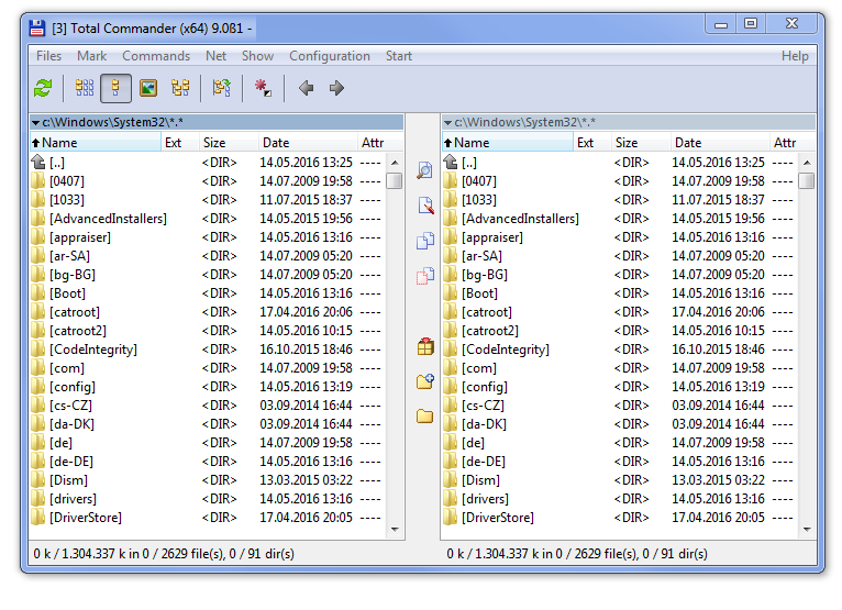
I thought about other elements which are placed above or below the file panels. There are different visual problems (based on Win 7 theme as example:
- The sorting color header is in the same line as the file list border. As they have different colors it looks bad.
- The sorting color header is in the same line as the file list border. As they have different colors it looks as if there is a gap between active path and file list.
- The active part is by default a quite dark color. It has the same border color as the filelist. So the border has no effect in contrast to the fill color.
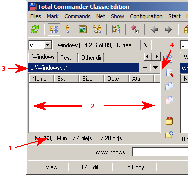
So what is the idea? The idea is to expand the padding to the other elements. It would look similar to this:
[img]http://fs5.directupload.net/images/160609/6p3rksa7.png[/img]
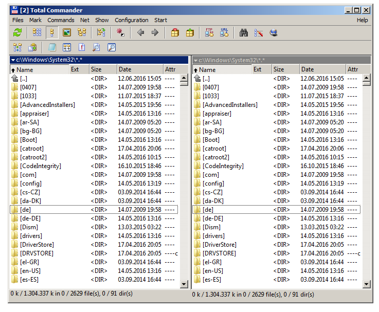
Here is an alternate version which expands the padding to the space between tab header and active path.
[img]http://fs5.directupload.net/images/160610/yv65nxpc.png[/img]
I added padding to the following elements which now appear in one vertical line:
- Current path
- Column header
- Cursor
- Status bar text
What do you think?

