

Yeah, that may be, but the percentage of those owning high DPI monitor is still very low. They just gathered in one place so it seems they are common.
Still, it is time for TC to get overhaul, and people will just have to get used to it, ans they got used to Win2k, WinXP, Win7, Win8, Win10.
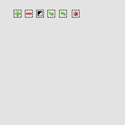
New Total Commander 9 icons available for testing!
Moderators: Hacker, petermad, Stefan2, white


2ghisler(Author)
I don't think just outlines make it look Win 3.1. On the other side using per-pixel transparency doesn't worsen the constrast.
The funny thing here is that many newer icons (to avoid the term modern) are outline-only or single color icons with controlled background colors. Well this has been discussed before...
I guess the basic downscaling should be done with a vector program like Inkscape (free) or Illustrator as you have a SVG. The next step is to the optimize it for the smaller size. I guess a designer knows how to do this...Most icons are combined from multiple icons, either 1:1 or downscaled with Gimp.
Another way to avoid outlines is control the background color/gradient/pattern - but this would be really unusual for TC...About the blurriness complaint: If the icons wouldn't be drawn with partial transparency, we would have the same problem as with the old icons: People would complain about "Windows 3.1" look because of the pixelated outlines.
I don't think just outlines make it look Win 3.1. On the other side using per-pixel transparency doesn't worsen the constrast.
The funny thing here is that many newer icons (to avoid the term modern) are outline-only or single color icons with controlled background colors. Well this has been discussed before...
I'm not sure if this is the case for the buttonbar but I have to admit it might be true for the main menu. This has nothing to do with HiDPI. I guess many users already prefer 24² and 32² icon size in the buttonbar.We started with 16x16 because these are the most commonly used on most user's screens.
The simplification I was thinking of is aimed in reducing to what is necessary. The result must be at least as good or better recognizable than before. The example I posted above is what I ment. It reduces unnecessary complexity.I agree that icons should be simplified, but if we simplify them too much, people will no longer recognize them.
As written before I would like to discuss some of the currently used metaphors like the asterisk as base icon for selections. For me asterisk is just a represenation of 'all'. So here are my ideas based on the 'rubber band' frame as used in iconexperience. Asterisk is used here too but only for the select all icon.
I have created some drafts (it's only about the metaphors not the visuals)
http://fs5.directupload.net/images/160510/dt96m374.png
I have created some drafts (it's only about the metaphors not the visuals)
http://fs5.directupload.net/images/160510/dt96m374.png

Lefteous,
Your mark icons look nice. However, since asterisk is more an 'inversion' than 'all', [*] icon may be used exactly for inversion, [+] for expanding, [-] for shrinking. Perhaps something like [*] and [*] could be used for selecting/deselecting all (or maybe something better?)...
Or maybe + sign should be used in all extension icons and - in all shrinking icons and some additional symbol like ... or ? could be used for dialog and * for all: [+?], [-?], [+*] etc ([] here means rubber band frame).
Also instead of undo/redo icons we could use some kind of box (diskette?) with arrows inside/out for saving/loading selection.
2MVV
Thanks for your reply - good thoughts!
Thanks for your reply - good thoughts!
Why is an asterisk more like inversion? 'Select all' means 'complete' the selection without considering the current selection while invert really means invert so selected files will be unselected and vice-versa. I think the current invert icon is okay for 16².However, since asterisk is more an 'inversion' than 'all', [*] icon may be used exactly for inversion
Interesting - that brought me an idea. As the rubber band is the metaphor for selection different colors could be used for selecting/unselecting. I guess it has to be black/red for obvious reasons...Perhaps something like [*] and [*] could be used for selecting/deselecting all (or maybe something better?)...
As there are many selection icons a unique way to disntinguish selection/unselection is welcome - as long as it works in the icon and isn't too complex.Or maybe + sign should be used in all extension icons and - in all shrinking icons and some additional symbol like ... or ? could be used for dialog and * for all: [+?], [-?], [+*] etc ([] here means rubber band frame).
Good idea it must be considered though that there are temporary and permanent ways to save the selection.Also instead of undo/redo icons we could use some kind of box (diskette?) with arrows inside/out for saving/loading selection.
Erm... I think because of its hotkey.Why is an asterisk more like inversion?
If we talk about wildcards, * is of course 'all', and it may be used for both expanding/shrinking selection.
Using colored frame sounds good but I think +/- signs may still be useful for ones with poor eyesight (even with black/red instead of green/red)...As the rubber band is the metaphor for selection different colors could be used for selecting/unselecting. I guess it has to be black/red for obvious reasons...
Indeed, and I think it should not be the same element that mentions which items will be selected/deselected.As there are many selection icons a unique way to disntinguish selection/unselection is welcome - as long as it works in the icon and isn't too complex.
So, frame as a selection, some elements for expand/shrink/inverse and an additional element telling what should be added/removed/inverted: custom mask, all items, files, folders etc.
Maybe file/clipboard icons for permanent ways and e.g. memory chip icon for temporary one?Good idea it must be considered though that there are temporary and permanent ways to save the selection.
-
ghisler(Author)

- Site Admin

- Posts: 50390
- Joined: 2003-02-04, 09:46 UTC
- Location: Switzerland
- Contact:
2Lefteous
Your selection icons look very nice. My fear is that people who used the old icons for years will not recognize the new ones any more.
Your selection icons look very nice. My fear is that people who used the old icons for years will not recognize the new ones any more.
That's the problem - the svgs need conversion to pixels and heavy optimizing to look decent in 16x16. I doubt that this will lead to better results than just adjusting an existing 16x16 pixel image.I guess the basic downscaling should be done with a vector program like Inkscape (free) or Illustrator as you have a SVG. The next step is to the optimize it for the smaller size.
If we knew a good designer familiar with Windows 10 Desktop icons this would be ideal, but no one seems to be doing these any more - they either moved to Windows Store icons or Android or iOS...I guess a designer knows how to do this...
Author of Total Commander
https://www.ghisler.com
https://www.ghisler.com
2ghisler(Author)
As TC9 will support rubberband selection when using left mouse button selection mode I think the time is right to change to the rubber band selection metaphor.My fear is that people who used the old icons for years will not recognize the new ones any more.
From my professional experience designers also have favorite design directions they like to discover but in the end a good designer is capable of doing what has been requested. Many designers might not have this kind of icon style (let's call it Windows 10 style) in their portfolio but only because it's not requested that often - I mean who does desktop applications for Windows 10 nowadays (I don't really like the trend but it cannot be denied).If we knew a good designer familiar with Windows 10 Desktop icons this would be ideal, but no one seems to be doing these any more - they either moved to Windows Store icons or Android or iOS...
-
ghisler(Author)
- Site Admin
- Posts: 50390
- Joined: 2003-02-04, 09:46 UTC
- Location: Switzerland
- Contact:
Yes, but it's optional (enabled by default).As TC9 will support rubberband selection when using left mouse button selection mode I think the time is right to change to the rubber band selection metaphor.
We are currently trying to improve the contrast/sharpness of the icons:
old
new
Author of Total Commander
https://www.ghisler.com
https://www.ghisler.com

http://iconfactory.com/
They can make whatever icons you want if you are willing to pay for them. Worth a shot to get in touch with them. They made icons for many big companies like Microsoft, Twitter, Lego etc.
They can make whatever icons you want if you are willing to pay for them. Worth a shot to get in touch with them. They made icons for many big companies like Microsoft, Twitter, Lego etc.

