
those gui change suggestions are awful..
if TC adopt any of them i'll stop using it, immediately!
current GUI works great for me and probably majority of users, some GUI changes like 100% different icon set (PLEASE NOT VISTA ONES) and dialogs revamp are needed though..
this GUI, of Nexus File, looks nice but also, there is plenty of space for improvement:
http://img43.imageshack.us/img43/7253/nexusfilev.png
[wish] Next Gen file manager - how it should look like?
Moderators: Hacker, petermad, Stefan2, white
It is not surprise that interface improvement topic will rise again. Well, it is already risen in this thread with this post.
Months have passed and it looks like developer did not pay attention to our sketches. Ok, fine with it. But now I'm here to share some thoughts about fresh info: Win8 Explorer improvements. Do not know if TC developer cares about interface convenience in future versions, but seems like other developers do care.
I like the 'speed history' feature. I wanted to find a place for it in my sketch v2.0 (see 1st post), but left the project when had found to be ignored. By the way, I still think it's good, but need to be 'reconcepted' for finger-touch mode.
Sorry, if win8 explorer is discussed in neighbor topic, I just came to my long gone thread and posted my thoughts...
PS I'm afraid, my Eng is still bad, sorry
Last edited by Kevlar on 2011-08-29, 08:01 UTC, edited 1 time in total.
Honestly, if TC8 came looking like this, I'd become founding member of "TC7 Forever" club. ;) Where's button bar and command line? "Convenient interface" doesn't go together with killing those.
Looking at your sketch, I see only one improvement and it's queue manager. You're not alone with this one. I don't know if I'd want it exactly like this, possibly yes, but I didn't think about it too much. I'm just sure that the current implementation has some space for improvements. :)
Looking at your sketch, I see only one improvement and it's queue manager. You're not alone with this one. I don't know if I'd want it exactly like this, possibly yes, but I didn't think about it too much. I'm just sure that the current implementation has some space for improvements. :)
-
Herr Mann

- Power Member

- Posts: 574
- Joined: 2004-05-30, 17:11 UTC
- Location: Niedersachsen, Deutschland
Herr Mann wrote:Version 8 in two Years? I hope not!IMHO TC 8.0 should finally focus more on GUI related issues (and bugs fixing, of course). It could kill some of the complaints about "terrible look".
Actually I'm quite happy except ...
But from my perspective the most important things in terms of the GUI are
- Icons greater than 32*32px, specially for the Thumbsview, if not preview available. The small (32*32) Icons looks silly and stupid between the large Preview.
- Use the "Windowssystem Icons" for all Filetypes. I will not use the same internal Icon (the yellow Box) for all Archvie-Files, how zip, 7z, iso, etc...
- A better and "smoother" integration in the Vista/Seven GUI, specially the space around the Menu and Buttonbar.
Whether the "XP themes background" is on or off.
It just does not look good, but it sort of weird and "old".
- The grouping of files should also be possible, like the Explorer
- Labels for the Buttonbar Icons, right from the Icon, optional of course
[Icon] Name [Icon] Name ...
- A new better Cursor.
I http://ghisler.ch/board/posting.php?mode=quote&p=183116&sid=2df1fe085ec8956e25da0f18c15b8163use inverted selection. This has the disadvantage, the normal Cursor ist not color filled and it is only a frame.
Two years have gone, and what has happened> http://www.extensoft.com/media/p2/images/EExplorer.png
Like this, it would be a would be an extreme GUI change.
But the design looks very good.
Nichts! Nothing! Rien! Niente! Nada!
NOTHING?Herr Mann wrote:Two years have gone, and what has happened
Nichts! Nothing! Rien! Niente! Nada!
Changed from Delphi-Compiler to Lazerus (wich was NOT easy)
making TC ready for Unicode
working on a 64Bit TC
...
calling that nothing is like sayin the Twin Towers where just some Towers...
Hoecker sie sind raus!
-
Herr Mann
- Power Member
- Posts: 574
- Joined: 2004-05-30, 17:11 UTC
- Location: Niedersachsen, Deutschland
Sure the change to Lazerus is not easy and the implement to Unicode is an important step.NOTHING?
Changed from Delphi-Compiler to Lazerus (wich was NOT easy)
making TC ready for Unicode
working on a 64Bit TC
But a Programm lives not only from changes in the background, but also from changes and updates in the GUI. And there is much to improve.
A better Icon support, new options to sort and group Files and small GUI revise are not impossible and this things will not change the roots and the basics.
It is very unfortunate that apparently no will exists, the TC-GUI also carry this into the new millennium. This will not worsen existing, it will improve and upgrade.
I am not surprised that some say the TC looks like the nineties.
I agree whole-heartedly with this statement, but if the forum membership is representative of the TC user population at large, then a significant portion of TC users are keyboard-centric and do not prioritize the GUI very highly.Herr Mann wrote:But a Programm lives not only from changes in the background, but also from changes and updates in the GUI. And there is much to improve.
Further, one should not denigrate the huge effort required to design/implement/integrate fancy new GUI controls into a Lazarus project.
For instance, if TC was a .Net product (heaven forbid!), then fancy panel docking, toolbars, trees, and all the many other UI niceties would be automatically available. But those niceties are the result of the programming efforts of (perhaps) scores of MS developers, not just one guy.
And yes there are full-featured "modern" GUI libraries available for Delphi development (which might require re-writing for use in a Lazarus project), but dependency upon outside parties for critical components of a finely hand-tuned tool such as TC may not be strategic, esp. if the majority of the TC user population simply has other priorities for the tool. TC is a file manager, after all, not a game or graphics tool.
Finally, IMO, the coming tsunami of gestural UIs on tablets (a la Windows 8 ) + the cloud-computing paradigm will, in the near future, further marginalize tools such as TC to the "backroom professional/server administrator et al" user market... the very people who, in the main, already do not care as much about GUI efficiency as the rest of us.
This all adds up to very slim incentive for a single developer such as Mr. Ghisler to invest much time and effort into making TC better looking, or more friendly toward the mouse-centric users amongst us. I am sad about this, being mouse-centric myself, but it really doesn't make much sense from the developer's point of view to enhance TC in the way some would wish. Better to spend that valuable time on the needs of the core user population...
Licensed, Mouse-Centric, moving (slowly) toward Touch-centric
-
Herr Mann
- Power Member
- Posts: 574
- Joined: 2004-05-30, 17:11 UTC
- Location: Niedersachsen, Deutschland
In my opinion it’s not about making everything more colorful or playful.
The idea is to improve the clarity. And here is graphics more important to transport information.
Many of us also use the larger display, than years ago. Here you can show more (e.g. Previews, Icons), without other information lost.
For example Windows 8 copy/move dialog, it looks very good.
Why? In opposite the small copy/move queue Window in the TC is confusing and not clearly arranged. Make it bigger and more informative!
This will not opposed to use the TC the the keyboard. This is one of the strength of the TC in in contrast to the explorer.
-
Balderstrom

- Power Member
- Posts: 2148
- Joined: 2005-10-11, 10:10 UTC
I'd rather see streamlined dialog boxes.
Eg:
1) Uploading changed files when TC is being used as the FileManager - requires 5 or 6 confirmation dialogs. And requires the editor to be closed.
2) Changing a Search/Select Filter: 4 confirmation dialogs.
There are numerous places where it is similarily awkward to accomplish a task in TC.
TC's poor handling of junctions/symlinks/etc, when you want to move a folder that contains them. E.G try moving a User folder with Total Commander, junctions will be converted to regular directories, content in similiar places will be duplicated and it will be a huge mess.
TC's inconsistent rules for what can be done/placed in the MainMenu, the StartMenu, a Button, the Directory Hotlist and the inability to use internal %P%S variables in the command line, as well as no internal cm_ commands.
Among many other requests in the Feature Request board for things that would streamline ones workflow.
Or the simple request to be able to have a setting for which direction the next tab should get activated when one is closed.
Or the simple request for another LockTab setting - one that doesn't force jump back to its original locked directory when it is reactivated.
Etc, Etc.
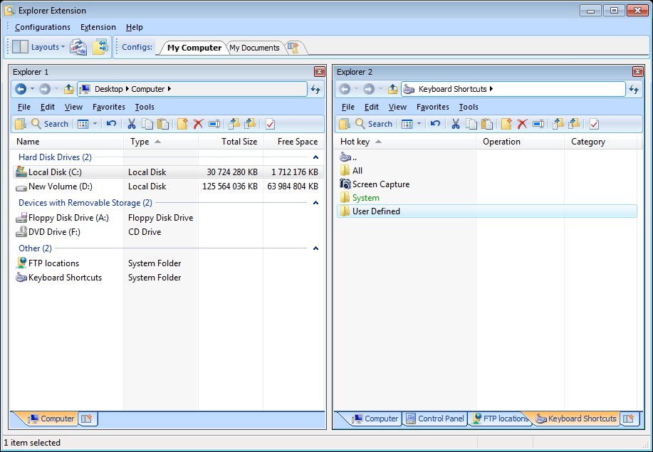
*BLINK* TC9 Added WM_COPYDATA and WM_USER queries for scripting.
Hello all,
Here is my last approach to next gen interface: interface concept v3.0. This time I was thinking about not only keyboard and/or mouse likers, but also about those who use tablets already.
For those who:
- do not see their favorite tools/fields/bars
- do not like color/icon/size
pay attention to main idea. All that things are options, as they are today.
I did not see all file managers, so if my concept is reality... well, silly me. tell me about those programs.
Notice, that in this concept search results are available to user until the next search, so user is able to switch to panels/operation tabs w/o losing them.
PS. I used graphics/interface elements from some famous programs again. Sorry. I do not earn any money with them.


Sorry but a filemanager on a Tablet?Kevlar wrote:Here is my last approach to next gen interface: interface concept v3.0. This time I was thinking about not only keyboard and/or mouse likers, but also about those who use tablets already.
Scary to work without a real keyboard...
www.4freeimagehost.com/uploads/0baffb601763.pngOffline wrote:Next idea for design improvement:
4freeimagehost_com_uploads_0baffb601763.png
4freeimagehost_com_uploads_e0ae4087b146.png
4freeimagehost_com_uploads_ee5f3d0483cd.png
www.4freeimagehost.com/uploads/e0ae4087b146.png
www.4freeimagehost.com/uploads/ee5f3d0483cd.png
Someone will surly like it I personaly dont cause it takes away to much space and can be done with stuff like quickview
(and for me looks to much like that UGLY SpeedCommander)
Hoecker sie sind raus!
LOL! I use Total Commander on my Windows Mobile smartphone- and it is *thumb up*!Sir_SiLvA wrote: Sorry but a filemanager on a Tablet?...
About 10 years ago I used Norton Commander, and used it up to Windows 95, Windows Commander was already developed.Sir_SiLvA wrote: Someone will surly like it I personaly dont...
NC was perfect for me.
Now I see TC looks in Windows 7 like NC in Win95.
I see on my favourite TC in Win7 and feel something wrong...
Often I use my 40" SamsungTV as screen and feel space is enough for any purposes
If some people still use 15" CRT then - yes - lets them to count pixels
My idea is not perfect, it is just 10_minutes sketch.
PS SPAMFILTER is CRAZY
Sorry I prefer TCs simple and functional look and the possibility to form it like I want over shiny CRAP you can find in other clonesOffline wrote:Now I see TC looks in Windows 7 like NC in Win95.
I see on my favourite TC in Win7 and feel something wrong...
PS: If you dont like the look of TC you can allways go and use SpeedCommander instead
Hoecker sie sind raus!