To bad some users STILL don't know the difference.
Look at this plz...
icfu wrote:Hasn't this been explained on the last four pages?
New is
- that you don't need to enter a directory before you can enter one of its subdirectories but you can choose the desired one in one step.
- that you have access to the complete file system, just like in the trees but more efficient.
- that you can drag&drop content from your working directory without leaving it or switching the target directory.
- that mouse users will benefit from it.
To make breadcrumbs perfect, they should of course be equipped with additional popup functionality for subdirectories, known from ShortPopUp, menuApp and the like, so you can also switch to directories located in a lower hierarchy level.
Hacker wrote:DarkRuleR,
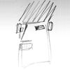
The dirs should expand to the right in your picture, IMO.
Roman
Hi Roman,
I thought about your remark but don't fully understand it.
B'coz the content of the breadcrumb window is the content from the c:\Windows\system32\ directory it is logical to pop-it-up / align under the system directory in the bar???
I thought about your remark but don't fully understand it.
B'coz the content of the breadcrumb window is the content from the c:\Windows\system32\ directory it is logical to pop-it-up / align under the system directory in the bar???
The alignment is fine, I just thought one should be able to also browse subdirs of the dirs that are displayed in the breadcrumbs menu (same way you can browse submenus of any other menu, for instance the Start menu), so when your cursor is placed on "[config files and other Wi..." then the menu should expand to the right and show the subdirs of that dir.
Roman
Mal angenommen, du drückst Strg+F, wählst die FTP-Verbindung (mit gespeichertem Passwort), klickst aber nicht auf Verbinden, sondern fällst tot um.
SpeedCommander's approach on Breadcrumbs looks better (faster) and more intuitive
than DirOpus IMHO. It looks more solid and slicker.
What I have to suggest is to keep it as simple as possible, speedier, intuitive
and with even fewer GUI elements.
To further elaborate on the above:
1. No need for those nasty arrow icons after every path element. Underlining
segments should do like TC already does. Color change is also a solution.
2. No need for the drop-down list to also include folder icons. It's a feature
for folder navigation anyway; we don't have to scream it out loud. Dir Hotlist
and Dir History list of TC don't include them wisely. Faster and easier for the
eye.
3. I don't like the idea of a drop-down list anyway for this feature. What could
be even more intuitive, simple and fast is to have a mouse-over feature over path
segments that will generate a tooltip-type list of the folders in link form. This will
require a single click only and all navigations will look "automated" and very fast.
"My only reason for still using M$ Window$ as an OS is the existence of Total Commander!" Christian Ghisler Rules!!!
Now really, I couldn't use the 8.x version for more than a half an hour. I just installed DO9 which managed to bore me in 5 minutes (I knew where to look ).
The problem with Dopus for a TC user is that, yes it can be made to behave (nearly) as TC does, but the effort needed to set it up that way is entirely unproductive for those of us who don't have lots of time on our hands. There are many good "pieces" in Dopus (the toolbar/menu system is outstanding and would be a great addition to TC), but the combination of them into a control surface that supports the way most of us TC users work with files is a major effort of discovery/frustration.
Despite its potential (and that breadcrumb bar I mentioned to start this thread), IMHO Dopus is barely functional "out of the box" and requires extensive reconfiguration to justify its use.
TC is a finished file manager, Dopus is a tool kit for building one.


http://ghisler.ch/board/viewtopic.php?p=120341#120341