Page 1 of 3
Copy dialog layout
Posted: 2013-09-07, 19:15 UTC
by Sob
I wanted to add something to
Verify after copy option in the copy dialog discussion about where to put the option, but the more I looked at the dialog, the more I realized that it could use so much more and it would be OT there. For example something like this:
Image:
http://web.hisoftware.cz/sob/tc/new-copy-dialog.png
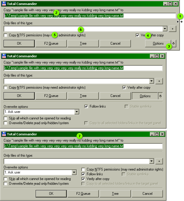
First of all, dialog should be horizontally resizeable (1). Why must we suffer within mere 425 pixels and have only partially visible filenames or pathnames (2) all the time, when no one uses resolution lower than 1024 any more. And if anyone used 640x480 for some strange reason, current dialog is still unnecessarily narrow even for that. Default (and minimum) width should also be increased, which would allow to put
Options button (3) on the same line as others. I hated this button taking whole line for itself since it moved to its current position. Also the fact that it disappears (or "transforms into lower panel" if you wish) when clicked, seems kind of strange too. The blue pin button, I'm also not a fan and I'd much rather combine it with
Options button. New minimum width is only 560 pixels, which is still acceptable for any resolution.
Thanks to increased width, there's plenty of space for new option (4). Although I'm not sure if it, together with
Copy NTFS permissions (5), really deserves this place. What makes these so special compared to by default hidden options below? And for that matter, filter (6) is an option too. Personally I use overwrite options much more often than
Copy NTFS permissions or
Only files of this type.
Perhaps we don't really need two sets of options? Wouldn't having all options together and always visible (7) work just fine? Dialog is still small and fits everywhere. And if someone doesn't need all those options, they can easily ignore them.
(link options - taken from MC and not present in current TC - are subtle hint that advanced file manager should really have these; and yesterday was too late already :)
Posted: 2013-09-07, 20:17 UTC
by MaxX
I think such a layout
http://iceimg.com/i/6c/92/62f3f60e96.gif would be more useful.
Posted: 2013-09-08, 01:35 UTC
by Sob
That's basically my first idea. Not with all the details, but to not change the dialog too much. I just don't like these option groups. Nothing against that in general, it's perfectly logical to have basic options (useful for most users and visible all the time) and advanced options (not needed so often or for advanced users only and hidden by default). But from options available in this dialog, which are basic and which advanced? It's not clear enough, at least not for all of them. So there comes the second idea to just put them all together.
But maybe that's too many options at the same time. And if someone doesn't need them, it would be nice to be able to hide them. And it couldn't be exacly like this anyway, because in other languages, some string are longer.
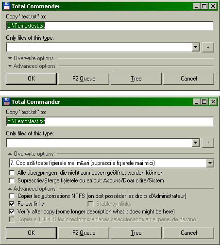
Idea #3, logical grouping of options (limited, as there are only two groups, but that could change with more future options):
Image:
http://web.hisoftware.cz/sob/tc/new-copy-dialog-2.png
It's a little multi-language, but it should be clear which option is which. Used strings are the longest ones from languages bundled with TC, to show that more options sharing one line would not work very well, without making dialog too wide. First
Overwrite options would need better name, because the option to skip unreadable files is not about overwriting. Something about user interaction (TC asking user what to do) would fit nicely.
Instead of pin button, the groups could simply stay open or closed as user had them for the last time. Or if "occasional opening" is viable scenario, there could be pin buttons on the right of divider lines (just a little smaller and preferably less colorful).
Posted: 2013-09-08, 09:55 UTC
by MVV
Sob,
I agree with most ideas. Resizeable width, buttons in a line. Copy permissions isn't really much useful (especially since it requires admin rights/elevation but today most users have UAC which restricts rights). Since we already have INI option
ShowCopyOptions to pin additional options, all options except filter should be moved to additional dialog part.
Here my working concept with source code.
Also it would be great to extend
ShowCopyOptions key to add more flags that will set initial state of additional options: overwrite mode, copy permissions, verify mode, skip mode, copy to all selected mode (0 - disabled by default, 1 - enabled be default if there is a selection in target panel). We have 32 bits that may be set so it is quite enough. Some other places already have INI keys to remember state (e.g. search dialog has key
LastSearchOptions).
BTW if we need two options for symlinks, it may be done by using three-state checkbox (unchecked, grayed, checked, together with text change) or even a combobox.
MaxX,
Overwrite options combobox shouldn't be so long. In your dialog it may be on the same line with 'Overwrite options:' label.
Posted: 2013-09-08, 15:57 UTC
by Sob
Live sample is nice, except few details. Buttons should align to right as in other dialogs. And I don't like Advanced options "button" too much, because it looks too prominent. Also when you open the options, the frame with maximum width without any spacing does not look as good with Aero (and that's what most people use). I like my dropdown variant better (that thing with arrow, I don't know what's the proper name, if it has one). It's not unknown to users, e.g. Explorer has that too in drive list. It also serves as header/title, even though it's clear even without it, that all those checkboxes are probably advanced options. :) And it allows to close them too, which is also not critical, but I like it. But sure, it's all just details.
Extending ShowCopyOptions, yes of course. But rather than remembering last state, it would be better to be able to save current settings as default. When I want some option enabled in most cases and only occasionally disable it, I don't want it to be remembered when I do. Next time I open the dialog, I want to have it enabled again.
Two options for symlinks are mandatory for relative ones. Because if I have symlink to ..\file.txt, I might want to copy it as is, to still point to ..\file.txt, no matter if target exists or not. Or I might want it to point to original target and it must be fixed. IMHO three-state checkbox would be a little confusing. Changing text would help, but I don't like dynamically changing things, you need to pay too much attention to that. And combobox seems too "heavy" for this. For me, two checkboxes win.
Btw, good news on the links handling front, there's already CopyLinks ini option. But it seems it's only supposed to work with directory links (not file ones) and it doesn't work for me, because copied links are always invalid. But maybe I just missed something and it's my fault, I must investigate that yet. And as global switch it's not very useful. But it's a good start.
Posted: 2013-09-08, 16:11 UTC
by MVV
I think it may be adjusted for Aero etc, it is only sample. Aero uses ugly wide borders...
Here updated example with sources.
Looks fine with Classic/Aero. There are no standard component that may expand/collapse something like in Explorer.
I agree that it is better to set initial state via
ShowCopyOptions key, not to remember last ones. However we may set additional bit of this key to disable remembering.

Posted: 2013-09-10, 01:20 UTC
by Sob
The expand/collapse component seemed as good idea when I thought there could be more groups, because it could serve as title. But more groups are in fact unnecessary and one panel with all advanced options is enough. And with that, the need for this component is gone. Custom components are troublemakers anyway, so I'm ditching that idea.
What I don't like about your current example is pin button for opening advanced options. Now it's too small and probably not obvious enough.
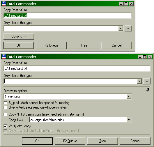
I played with standard text button (Image:
http://web.hisoftware.cz/sob/tc/new-copy-dialog-3.png), but I can't say I'm completely satisfied with that. It again takes whole line for itself, which I don't like in current TC, although at this position above other buttons it doesn't look nearly as bad. And putting it on the same line as others now doesn't feel right, when it would open the panel above.
Except that, I got nice button-less pin (serves its purpose and doesn't draw all attention to itself as current "blue beacon" does ;), combo for link options (I think more than three might be needed, so combo would make sense) and combos in advanced options probably should not stretch (empty space at the right does not look exceptionally well, but extremely wide combos look worse).
Posted: 2013-09-10, 10:52 UTC
by MVV
Size and contents of opening button may be changed easilly, so it is not a problem. Also, text may be added to the panel with pin button (panel w/o borders but clickable). BTW I like this small button, it takes a little space but it is still clearly visible. New user will notice it anyway and will explore what it does. We only need a nice icon and hint for it.
What can you say about my idea to replace '+' button with additional drop-down list item? I think it looks much better and still accessible while additional button that causes combo box width to be reduced looks bad.
Example with labels, hints, nice pin buttons (and with right-aligned advanced options).
In TC pin button's border may be removed, it is not a problem. Anyway, I don't like its view too.
I would prefer radio buttons for link related cases because of shortcuts for every item.
Posted: 2013-09-10, 20:59 UTC
by Sob
I would prefer pin as single-color glyph. It could use text color to fit nicely with any possible theme, unlike nice (I read color) icon, where there's always a chance for bad looking combination. I can imagine coloring some gray-scale template according to current theme, but I'm not sure if author would go for it. But we don't know that for any of our ideas, no sign of excitement from him so far... ;)
About "+" button, I have no strong feelings. Your method for adding new items would be great for saving space, but in this case, we have much more width than we need. Separate button is good as clear indication that you can add something. One or the other, I'm good with both.
In current TC, it mainly looks bad, because it's misaligned (yep, I belong to pixel hunters). In Classic theme it matches the bottom of combo, but it's two pixels too high. In Aero it has same height as combo, but it's shifted one pixel up. The lack of space between combo and button also doesn't help.
Although in TC, I try hard to not notice these things, otherwise I would go mad, because it's all over the place.
Right-aligned advanced options, not a fan. Empty space at right is not nice, but empty space at left is worse.
For links, there might be quite a lot of possible options, because unlike Unix, where three cover all, Windows have things more complicated with different drive letters (more roots) and absolute path junctions. I'm thinking about it and I'm currently at five.
Posted: 2013-09-11, 11:14 UTC
by MVV
Your method for adding new items would be great for saving space, but in this case, we have much more width than we need. Separate button is good as clear indication that you can add something.
It doesn't look nice because there are two buttons near the second editbox (combobox) while there are no one near the first one. I think anyone who opens drop-down will notice new menu item...
Black pin button.
I think it may be complicated to pin button color as text color BTW...
Posted: 2013-09-11, 12:23 UTC
by MaxX
2
MVV
what about hiding expanded options back?
just modify this one
http://iceimg.com/i/6c/92/62f3f60e96.gif [2.0]
this way:
[1]. remove "options" button - pin does it's job and remembers last state
[2]. "overwrite options" fade list uses only left-half of the line
[3]. move "check after copy" down to another extras (to the right of [2])
[4]. move "copy to all selected..." to 3rd line of left column
[5]. follow links and stable links -> 2 lines to right of "skip..." and "overwrite hidden..."
Posted: 2013-09-11, 12:42 UTC
by MaxX
or...
I've got much better idea!
Just when thougnt about my {remove "options" button - pin does it's job and remembers last state}...
Then tried some experiments in mspaint and got this one:
http://iceimg.com/i/a8/69/a5a44610d9.png [3.1]
and this:
http://iceimg.com/i/f0/3c/c548578596.png [3.2]
It's more compact than other suggested + has full functionality.
p.s.
"ntfs-rights" line is NOT hidden - it's very important...
Posted: 2013-09-11, 13:00 UTC
by MVV
I think pin button shouldn't be the same as options button. Options button only shows additional panel while pin button tells how to show that panel next time. If I need additional panel this time it doesn't mean that I will need it next time.
Placement of checkboxes in advanced options panel is a subject to change, first of all we need to think out overall dialog design. Different languages may need different label lengths...
I don't think we need to hide advanced options back. Copy dialog is only opened for some operation so additional panel may be left until it is closed and become hidden again on next dialog display if not pinned. So options button is only needed until we open additional panel. It may be placed to the right to 'Only files of this type' label (aligned with right side of edit boxes) BTW. However it isn't related to this control so it is not a good place. Separate line is good place for such button since we can put some most frequently used checkbox to it and options button will be perfectly suited for that line.
Posted: 2013-09-11, 13:31 UTC
by MaxX
2
MVV
Placement of checkboxes in advanced options panel is a subject to change
That's not so important to change current positions.
My main idea is to
remove second button line with only one button
"options" with something more functional. It looks really ugly.
UPD:
See here to compare what I mean:
http://screenshotcomparison.com/comparison/40637 (hover mouse cursor on image to see my mod, move cursor away to see default one)
1. As you see, buttons' texts are short enough to place options button to main button line.
2. "▼" ("Alt+31" symbol) is more compact than ">>"
Posted: 2013-09-11, 14:08 UTC
by MVV
My main idea is to remove second button line with only one button "options" with something more functional. It looks really ugly.
I agree that it looks bad. And I don't suggest to use it.
Here a concept with advanced options panel below command buttons.
1. As you see, buttons' texts are short enough to place options button to main button line.
2. "▼" ("Alt+31" symbol) is more compact than ">>"
Maybe some languages will require more place for text. And, "▼" is a non-standard character.