

Here is another idea for a layout change in TC. Currently the drive buttons are between the buttonbar and the file list. As the list of drives can be quite long, this may even lead to a second line of drive buttons. My idea is to display the drive buttons in a panel next to the file list panels.
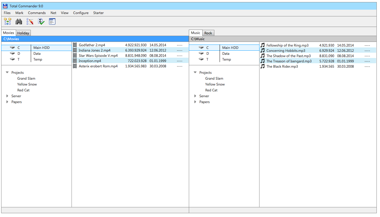
As such a panel could be more than enough space for just the drive buttons it could be also used for all kind of other contents. It could de devided in sections (see mockup) or by tabs (not in the mockup). In addition to the drive buttons it could be used for the directory hotlist and/or the history and of course for the separate trees (already implemented).
I know that such panels will not reduce the overall complexity but I think it's worth a try. The top area would look cleaner at the cost of one more panel next to the file panels.
1.) Larger additional panels on each side displaying a drive selection and directory hotlist: http://lefteous.totalcmd.net/tc/ideas/docked_panels.png
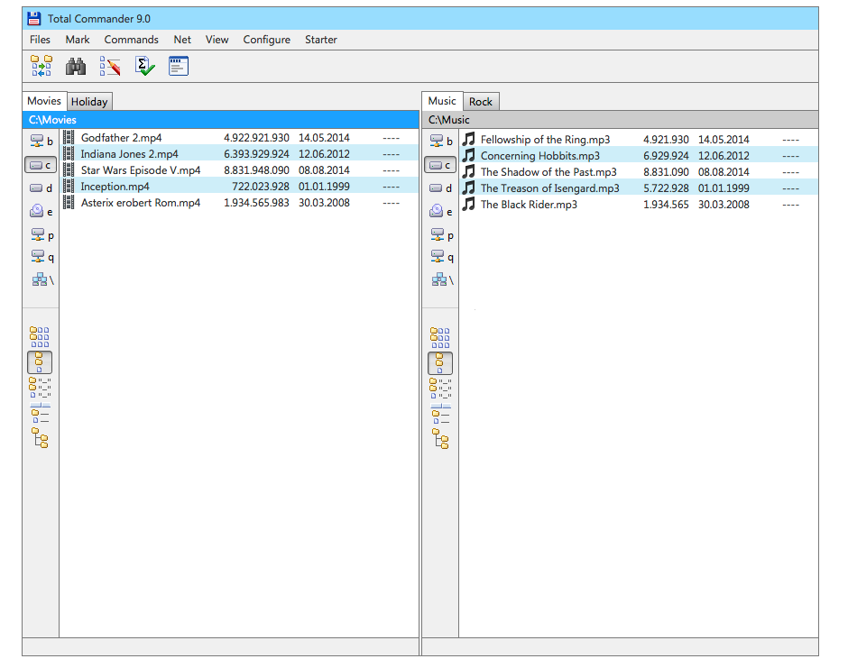
2.) Smaller additional panels on each side displaying drive buttons and a few custom side-specific commands:
http://fs2.directupload.net/images/150520/8vxff4lf.png
Vertical drive buttons in docked panel
Moderators: Hacker, petermad, Stefan2, white
Vertical drive buttons in docked panel
Last edited by Lefteous on 2015-05-20, 10:00 UTC, edited 1 time in total.


This might be a good option for users of widescreen resolutions. I find that usually the main panels tend to not have enough width to display file names and sizes of ever increasing length.
Star Wars - [01x07] - Inception of the Red Cat (Part 1).mp4
Star Wars - [01x07] - Inception of the Red Cat (Part 1).mp4
#148174 Personal license
Running Total Commander v8.52a
Running Total Commander v8.52a

Yes it's defintely something for owners of wide monitors. There is a certain trend observable where displays become wider and wider in aspect ratio. 16:9 is standard nowadays and the 3440x1440 is really popular. On the other hand these monitors provide often do not provide that much height.
What have you guys done when the standard was 1280x1024 or even 1024x768?
I would definitely not display this by default but of course offer a way to switch to such a view quickly.
What have you guys done when the standard was 1280x1024 or even 1024x768?
I would definitely not display this by default but of course offer a way to switch to such a view quickly.
Here is another variant of such a vertical, docked, and sided-specific bar. It's way more compact as it only contains the drive buttons and a few custom and side-specific commands.
[img]http://fs2.directupload.net/images/150520/8vxff4lf.png[/img]
[img]http://fs2.directupload.net/images/150520/8vxff4lf.png[/img]

You could also add autohide and auto expand/scoll options. And merge this proposal with the "semi-floating" central button bar ...Lefteous wrote:Yes it's defintely something for owners of wide monitors. There is a certain trend observable where displays become wider and wider in aspect ratio. 16:9 is standard nowadays and the 3440x1440 is really popular. On the other hand these monitors provide often do not provide that much height.
What have you guys done when the standard was 1280x1024 or even 1024x768?
I would definitely not display this by default but of course offer a way to switch to such a view quickly.
//but it takes anyhows a lot of space than can be used with additional columns

This could be nice to have as an option. But maybe the bar for the right panel should be placed to the right of the file panels, and then it should be possible, just as with the current drive button bar, to choose only one bar that works for both file panels, and that bar should then be placed between the two file panels.Lefteous wrote:Here is another variant of such a vertical, docked, and sided-specific bar. It's way more compact as it only contains the drive buttons and a few custom and side-specific commands.
[img]http://fs2.directupload.net/images/150520/8vxff4lf.png[/img]
License #524 (1994)
Danish Total Commander Translator
TC 11.51 32+64bit on Win XP 32bit & Win 7, 8.1 & 10 (22H2) 64bit, 'Everything' 1.5.0.1391a
TC 3.60b4 on Android 6, 13, 14
TC Extended Menus | TC Languagebar | TC Dark Help | PHSM-Calendar
Danish Total Commander Translator
TC 11.51 32+64bit on Win XP 32bit & Win 7, 8.1 & 10 (22H2) 64bit, 'Everything' 1.5.0.1391a
TC 3.60b4 on Android 6, 13, 14
TC Extended Menus | TC Languagebar | TC Dark Help | PHSM-Calendar