
It seems that TC9 draws more window elements in flat mode so it is impossible to have flat buttons with bordered panels:
- Borders in flat mode are all flat but in non-flat mode all buttons (F-buttons, path bar buttons) are non-flat, also label panels have borders
Please add an option to enable old good view with flat label panels and buttons and non-flat file panels.
Also some elements are always flat:
- Toolbar's upper and lower lines are always flat now
- Vertical bar has always flat borders
Screenshots
[9.0b1x86] Too flat interface
Moderators: Hacker, petermad, Stefan2, white
-
ghisler(Author)

- Site Admin

- Posts: 50550
- Joined: 2003-02-04, 09:46 UTC
- Location: Switzerland
- Contact:
Sorry, I don't get it. What exactly is wrong? Which mode, the flat mode or the non flat mode? Your screenshots look OK to me?
Author of Total Commander
https://www.ghisler.com
https://www.ghisler.com
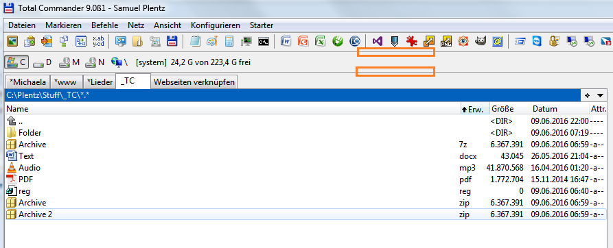
1. Horizontal lines above and below buttonbar look different in 8.52a and 9.0. In 8.52a they are a bit sunken, just like buttonbar separators, and it looks pretty nice.
2. Please look onto file panel borders in 8.52a and 9.0. In 8.52a file panels are sunken but borders in 9.0 are simply one-pixel lines (maybe it is related to this report).
It would be very nice if both these things have looked as in 8.52a when 'flat user interface' is enabled (at least with INI option) - this will give us exact 8.52a look.
-
ghisler(Author)
- Site Admin
- Posts: 50550
- Joined: 2003-02-04, 09:46 UTC
- Location: Switzerland
- Contact:
I reduced these on purpose to make TC look less like Windows 3.1, as some people call it.
Author of Total Commander
https://www.ghisler.com
https://www.ghisler.com
As far as I remember, Windows 3.1 had flat thin borders (like modern Windows have, and like ones that I ask to revert back) - look e.g. here.
On the contrary, Windows 9x and XP (classic style) had nice 3D look - look here. Please note the borders and toolbar frames - just like in TC 8.52a.
So please add an option to enable former classic Windows XP style for ones who prefer it.
On the contrary, Windows 9x and XP (classic style) had nice 3D look - look here. Please note the borders and toolbar frames - just like in TC 8.52a.
So please add an option to enable former classic Windows XP style for ones who prefer it.
Don't listen to some people, they won't be happy unless you add ribbons, show files as huge tiles, give every part of UI 20px font and 20px padding, because that's what's considered "modern" these days. ;)
But seriously, this change really did not help much, if at all. If you compare old (2px) and new (1px) lines on Windows 7 to 10 with default themes, you will hardly see any difference. It's because these themes have default background color much brighter than it used to be in the past, and there isn't much difference between that and light part of old line. But Classic theme (optional in Windows 7) relies on 2px lines for its "3D" look and the difference is very noticeable there.
I would humbly suggest to just return it back as it was. It's not like it did any good to non-Classic themes anyway.
-
Samuel

- Power Member

- Posts: 1930
- Joined: 2003-08-29, 15:44 UTC
- Location: Germany, Brandenburg an der Havel
- Contact:
Sorry to say: I really like the new look. I would even remove further lines: http://abload.de/img/newlookqnxap.png

There's difference between Classic and other themes:
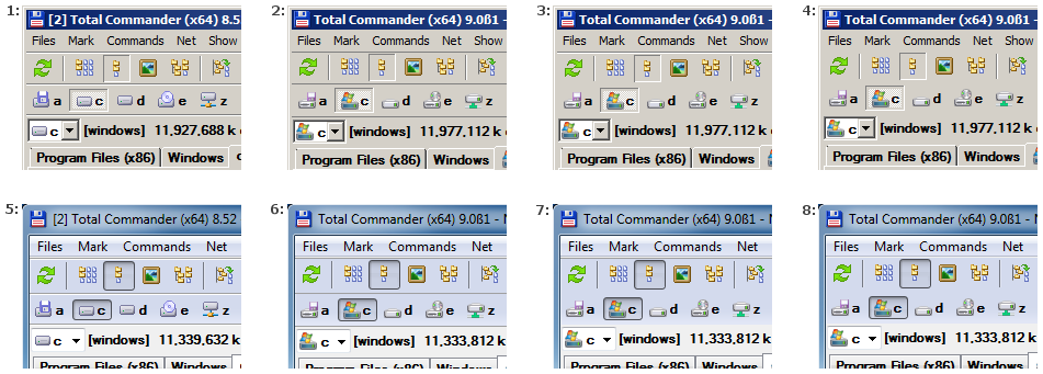
Image: http://web.hisoftware.cz/sob/tc/tc9-ui-lines.png
Screens 1 and 5 (TC8) and 2 and 6 (TC9) are real. I can't help it, to me 2 looks like the program is sick or something. ;) Classic theme needs its 3D style.
Screens 4 and 8 are my edits how it would look if TC did not have any lines (including the one under menu). I think it works well for Aero theme 8, because system menu itself has line. But not for Classic 4, it's horribly flat, it needs at least the line under menu (3). While I still prefer 1, I think that 3 isn't too bad either. But with Aero theme 7, the top line is completely unecessary, it looks better without it (8).
A solution for not having the double line below the menu in some themes is appreciated but as discussed in the past it might not be possible to detect it automatically. So I would suggest using a heuristic as most people use standard themes. Something like this:... it needs at least the line under menu (3). While I still prefer 1, I think that 3 isn't too bad either. But with Aero theme 7, the top line is completely unecessary, it looks better without it (8).
-1 (default)= detect necessity for a border automatically based on known themes.
0=don't show border
1=show border
-
ghisler(Author)
- Site Admin
- Posts: 50550
- Joined: 2003-02-04, 09:46 UTC
- Location: Switzerland
- Contact:
Sorry, I will not return to the look of TC8. I'm sick of people complaining that it looks old because of too many lines.
Author of Total Commander
https://www.ghisler.com
https://www.ghisler.com
-
Emalis.Reckah
- Junior Member

- Posts: 30
- Joined: 2016-06-13, 21:03 UTC