Yes, the one looking like the sun was the closest we could find to replace the *. There is only a 5 tip star in the G Collection (#219 or #220).
https://www.iconexperience.com/g_collection/icons/
New TC 9 icons now in 24x24 and optional in 48x48
Moderators: Hacker, petermad, Stefan2, white
-
ghisler(Author)

- Site Admin

- Posts: 50561
- Joined: 2003-02-04, 09:46 UTC
- Location: Switzerland
- Contact:
Author of Total Commander
https://www.ghisler.com
https://www.ghisler.com
-
Samuel

- Power Member

- Posts: 1930
- Joined: 2003-08-29, 15:44 UTC
- Location: Germany, Brandenburg an der Havel
- Contact:
ghisler(Author) wrote:The 16x16 icons have received a stronger outline on purpose because after resizing to that small size, they became very blurry and barely recognizable. If you can do better, go ahead.
I like the most of the new icons.ghisler(Author) wrote:Anyone. So far there have just been complaints, but no one has shown anything better. Just don't use the new icons if you don't like them.
Here is how I would create the 16x16 versions of some icons: (depending on the icons here: https://www.iconexperience.com/g_collection/icons/)
https://abload.de/img/symbolez4sg5.png
1) TCs thumbnail icon
2) my thumbnail icon - uses original colors
3) TCs copy icon - blurry
4) my copy icon - uses original colors
5) TCs move icon - blurry
6) my move icon - uses original colors
7) TCs pack icon
8 ) my pack icon - uses original colors
9) TCs addFolder icon
10) my addFolder icon - slightly larger; uses original colors
11) TCs copyNames icon
12) my copyNames icon #1 - uses original colors; no modification to the icon
13) my copyNames icon #2 - uses original colors; modification like before; i am not convinced that it got better - would prefer #1.
I would stick to the original colors. (perhaps this is personal taste) The copy, move and delete icons should be deblurred. The asterisk should be reworked. The selection undo / redo button should probably use the undo / redo icons (#1 and #2)

2Samuel
Thanks for continuing this discussion. Unfortunately I haven't had the time yet to create some suggestions. I hope I can do that later.
First a general visual remark. Your (discrete) glossy effect definitely doesn't fit the icon style. I think this should not even be considered. It doesn't really help visually.
An approach for middle dark icons could be to make them even darker.
I agree that the orig. location part of the move icon should use the red singnal color (same as deleted).
Visually I don't agree that the TC icon looks blurry - yours has a slightly stronger outline. On the contrary the stronger document lines in the TC icon makes it better recognizable. TC copied file part of the TC icon could look a bit stronger and sharper - similar to the move icon (using other colors).
Visually the green arrow is lost in the clipboard icon (on both).
Thanks for continuing this discussion. Unfortunately I haven't had the time yet to create some suggestions. I hope I can do that later.
First a general visual remark. Your (discrete) glossy effect definitely doesn't fit the icon style. I think this should not even be considered. It doesn't really help visually.
By using an outline even closer to the common bg color your icon has less contrast compared to the new TC icon. For me it looks a bit lost.TCs thumbnail icon
An approach for middle dark icons could be to make them even darker.
Sorry but your copy icon looks like a move icon. The original file appears as no longer there.TCs copy and move icon
I agree that the orig. location part of the move icon should use the red singnal color (same as deleted).
Visually I don't agree that the TC icon looks blurry - yours has a slightly stronger outline. On the contrary the stronger document lines in the TC icon makes it better recognizable. TC copied file part of the TC icon could look a bit stronger and sharper - similar to the move icon (using other colors).
I would say the color change is really about personal taste.pack icon
I think the + icon scaling is better in the TC icon. The smaller folder icon is used to give the + its own room. I don't think we need a change here.addFolder
I think both icons don't work. Even the old icon was difficult as a clipboard icon as t's generally used as paste icon. So it would be great to combine a filename representation and a copy icon.copyNames
Visually the green arrow is lost in the clipboard icon (on both).
-
Samuel
- Power Member
- Posts: 1930
- Joined: 2003-08-29, 15:44 UTC
- Location: Germany, Brandenburg an der Havel
- Contact:
To clarify: I tried to use the icons as much as I could as provided by iconexperience. I did not add any effects. Christian should have removed effects / details by changing contrast / outline etc.Lefteous wrote:2Samuel
Your (discrete) glossy effect definitely doesn't fit the icon style. I think this should not even be considered. It doesn't really help visually.
IMO the blurry look comes from the stronger document lines. The original has 5 light document lines, TCs has 3 strong ones. I like the original look more.Lefteous wrote:Visually I don't agree that the TC icon looks blurry - yours has a slightly stronger outline. On the contrary the stronger document lines in the TC icon makes it better recognizable. TC copied file part of the TC icon could look a bit stronger and sharper - similar to the move icon (using other colors).TCs copy and move icon
-
Samuel
- Power Member
- Posts: 1930
- Joined: 2003-08-29, 15:44 UTC
- Location: Germany, Brandenburg an der Havel
- Contact:
Lefteous wrote:2SamuelYou didn't use the gradient style - which TC does. I guess you used the standard style.To clarify: I tried to use the icons as much as I could as provided by iconexperience. I did not add any effects. Christian should have removed effects / details by changing contrast / outline etc.
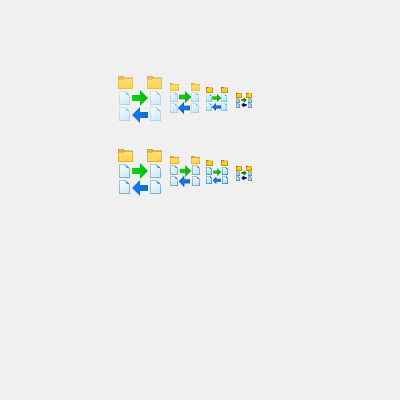
So here is a quick visualization of my thoughts here. I picked the sync. folder as an example as it contains micro folder icons and micro file icons - which have been adapted quite differently to a smaller size.
As written in another thread I would prefer a simpler icon for folder sync ( simple mockup based on old lib: http://fs5.directupload.net/images/160506/vf2vz8c5.png ). So this is just about the visual details which also apply to quite a few other icon in the lib.
1) While the folder icons have a quite strong outline in 16px and 24px it's not so strong in 32px and 48px.
2) The file icons have a strong outline in 16px but not really in larger sizes.
3) The file icon in 16px (and a bit in the 24px icon) also has another background color. I think the downside of this that the contrast would be even higher when the background of the icon would not have been changed. Now it looks just darker.
4) The arrow between the file icons looks squeezed in 24px and 32px.
5) The file icons look misaligned 24px and 32px.
I did the following:
1) Very slightly increased the outline of the folder icons for 32px and 48px icons.
2) Increased the outline of the file icons for 24px (slightly), 32px and 48px icons.
3) Scaled arrow to get an even spacing of 1px between the file icons in 24px and 32px.
4) Aligned the file icons to the folder icons in 24px and 32px.
http://lefteous.totalcmd.net/tc/ideas/sync_folder_suggestions.png
Here is a suggestion for the 'select all' icon.
http://lefteous.totalcmd.net/tc/ideas/select_all.png

Under my point of view, the current icon for refresh action, is not clear enough for me. It seems more like a kind of 'exchange' action or similar instead a re-read action.
I did some attemps as suggestions (3er line) in the attached image: http://breto.net/totalcmd/temp/proposal_new_refresh_icon.png
Maybe could you check it and give your opinions?
JMB
I did some attemps as suggestions (3er line) in the attached image: http://breto.net/totalcmd/temp/proposal_new_refresh_icon.png
Maybe could you check it and give your opinions?
JMB
-
Balderstrom
- Power Member
- Posts: 2148
- Joined: 2005-10-11, 10:10 UTC
Aren't there any TC Artistés? ... that can create the 16px (maybe even 20px! too) sizes without needing to resort to utility-software resizing?
I've used utility-resizing on PNG/ICONS before, you almost always have to touch it up somewhat if you let it auto-size down to the 16-20px sizes - even if just to get rid of the very strong outlines.
You'll also (almost always) get a better "icon" at the smaller sizes (if using tools) by taking the largest image available, and resizing it with a decent image manipulation tool like MeeSoft Image Analyzer (or Photoshop, or what have you).
Then taking that 16x (or 20x) image and using it as the icon instead. The outer lines wont be as hard.
*BLINK* TC9 Added WM_COPYDATA and WM_USER queries for scripting.
-
Balderstrom
- Power Member
- Posts: 2148
- Joined: 2005-10-11, 10:10 UTC
Yes. Or just hire a graphic artist to make a set of icons for TC. I do it the half-assed way cuz 1) I'm not a graphic artist; 2) I can't afford to pay the wife to do it for me.Lefteous wrote:Just one remark on the search icon. It includes a few letters below the binoculars. The iconexperience icon is ment as a text search icon. The letters should be removed.
2Balderstrom
For real production quality one would work based on the SVGs which only owners of the icon set have...
*BLINK* TC9 Added WM_COPYDATA and WM_USER queries for scripting.
-
ghisler(Author)
- Site Admin
- Posts: 50561
- Joined: 2003-02-04, 09:46 UTC
- Location: Switzerland
- Contact:
It's not done yet, we are currently reworking the icons. Some suggestions are good, like stronger outlines for the 24x24-48x48 icons for files/folders: Actually these icons use the original file/folder icons from the G collection, which have very weak outlines.
Author of Total Commander
https://www.ghisler.com
https://www.ghisler.com

