
I'll just drop several vague ideas and maybe some of that would be found interesting.
1) It might be nice to have the difference number (index in the list) to be displayed.
Or maybe even an entry field with direct jump by difference number.
I do not expect that this index would be tracked when user randomly moves around; only on go to next/previous difference commands.
2) Another "vertical" positioning helper: colour stripes which mark differences in scrollbar or nearby. It seems to be a stock feature of modern diff tools (though the idea existed in times of ancient Windiff program, if not before).
Edit. There are two vertical scroll bars. It both move synchronously, then one could be replaced with graphic representation of differences.
3) Done two lines are displayed at the bottom.
There is already a topic in Suggestions about highlighting found text (with yellow marker-like background). While I agree with that, I also think that similar background highlighting (with different hue, naturally) might be a great help in ordinary difference display.
It is quite a chanllenge to find a single-character difference - dot or comma (let alone space) in a line, especially when a lot of horizontal scrolling is involved.
4) Done, Alt+Left/Alt+Right for fast horizontal scroll.
Speaking of horizontal scrolling - it is too slow with keyboard, and mouse clicks on a scrollbar is an inconvenient method in most cases.
Could Ctrl-Left/Right combinations be added to scroll by wider steps?
Step might be measured in character width or in (fraction of) panel width.
Edit.After a while I understood that we are using PgUp/PgDown without major problems, and so scrolling horizontally by full width of panel would be good.
Small wishes for Compare by content tool
Moderators: Hacker, petermad, Stefan2, white
Small wishes for Compare by content tool
Last edited by browny on 2023-09-04, 11:44 UTC, edited 3 times in total.


Good suggestions, thohg I dont know what 2) really does. Support++
License #524 (1994)
Danish Total Commander Translator
TC 11.51 32+64bit on Win XP 32bit & Win 7, 8.1 & 10 (22H2) 64bit, 'Everything' 1.5.0.1391a
TC 3.60b4 on Android 6, 13, 14
TC Extended Menus | TC Languagebar | TC Dark Help | PHSM-Calendar
Danish Total Commander Translator
TC 11.51 32+64bit on Win XP 32bit & Win 7, 8.1 & 10 (22H2) 64bit, 'Everything' 1.5.0.1391a
TC 3.60b4 on Android 6, 13, 14
TC Extended Menus | TC Languagebar | TC Dark Help | PHSM-Calendar

petermad,
I think 2) is a comparison map that shows where files are different or equal. You can google for images using windiff term to see how it looks in different comparers.
I think 2) is a comparison map that shows where files are different or equal. You can google for images using windiff term to see how it looks in different comparers.
I see - that does not look like a small wish. But the 3 others look like they are relatively easy to implement, especially 4)I think 2) is a comparison map that shows where files are different or equal. You can google for images using windiff term to see how it looks in different comparers
License #524 (1994)
Danish Total Commander Translator
TC 11.51 32+64bit on Win XP 32bit & Win 7, 8.1 & 10 (22H2) 64bit, 'Everything' 1.5.0.1391a
TC 3.60b4 on Android 6, 13, 14
TC Extended Menus | TC Languagebar | TC Dark Help | PHSM-Calendar
Danish Total Commander Translator
TC 11.51 32+64bit on Win XP 32bit & Win 7, 8.1 & 10 (22H2) 64bit, 'Everything' 1.5.0.1391a
TC 3.60b4 on Android 6, 13, 14
TC Extended Menus | TC Languagebar | TC Dark Help | PHSM-Calendar
Let me explan about that windiff subject.
That was just a prototype idea; I do not ask for reimplementation of windiff - even though its source code is available and its comparison algorithm sometimes works better than TC's. Also I do not need maps for both files (let alone those lines connecting equal blocks - very fancy, but also useless).
It you saw how recent Visual Studios mark on the right side (between editor's pane and scrollbar) things like changed lines, errors or found text, then you would have much better understanding of my idea. Or if you know VS built-in diff tool. If file is long and proportional marking might get too narrow, then a small colour "brick" would be painted - still a good clue.
What I suggest is just colour markings where the files differ. Perhaps not in the scrollbar itself, but rather in a separate narrow "map" strip nearby.
When TC compares two files, it makes virtual panels of the same vertical length, and that length is represented as the scrollbar's length.
Now paint the "map" with standard background where lines are equal and red where lines differ.
Does it look complex?
That usually is reperesented with a thumb on a scrollbar.MVV wrote:Visible window should also be drawn on the map, e.g. with different background.
A few things could be marked simultaneously, but let's see if the author would like these ideas.MVV wrote:I think that in case of editing modified lines may also be marked...
Last edited by browny on 2016-08-02, 12:24 UTC, edited 1 time in total.
Thumb height doesn't reflect visible window size (it would be too tiny in case of very large files) so window size may be different. E.g. Visual Studio shows visible window with different background.That usually is reperesented with a thumb on a scrollbar.
It does reflect in some implementations; just take a second look at TC's Compare by contents window.MVV wrote:Thumb height doesn't reflect visible window size
Obviously, the thumb size should not drop below reasonable limit.
... and so would be background markings.MVV wrote:(it would be too tiny in case of very large files)
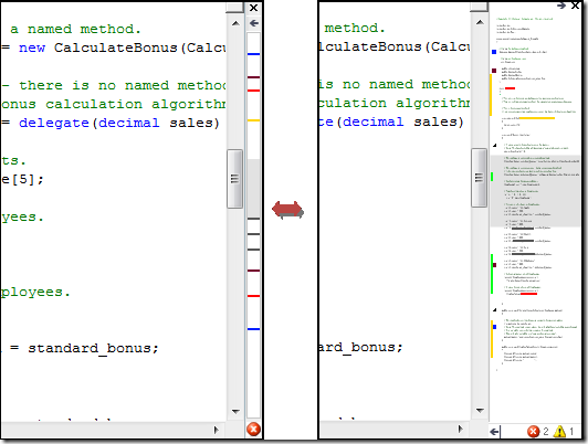
Your picture shows extension or some other tool, not built-in development environment code editor.MVV wrote: E.g. Visual Studio shows visible window with different background
Here you can get detailed description.
I must say that this feature is extremely convenient in VS.
And it is correct because visible window will be too small.... and so would be background markings.
You're right. Anyway, I've just tried opening 180MB file in VS2015 and noticed that thumb is too small... however I don't believe that too much people will edit such text files in VS, while TC should be prepared for huge files.Your picture shows extension or some other tool
Re: Small wishes for Compare by content tool
Points 3 and 4 were implemented, thanks. The first post was updated accordingly.
The only issue with point 3 is that white space is invisible (especially when trailing whitespace is the only difference), otherwise it was very helpful.
Can other points be discussed and/or become candidates for implementation?
The only issue with point 3 is that white space is invisible (especially when trailing whitespace is the only difference), otherwise it was very helpful.
Can other points be discussed and/or become candidates for implementation?