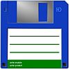
I did consider some user remarks and slightly retouched TC's main icon:
Look here for the very first result.
I didn't change much, but on a canvas that small, a few pixels and a slightly adjusted coloring might make quite a difference. Comments welcome...
New Application Icon
Moderators: Hacker, petermad, Stefan2, white
-
StickyNomad

- Power Member

- Posts: 1933
- Joined: 2004-01-10, 00:15 UTC
- Location: Germany


-
sqa_wizard

- Power Member
- Posts: 3893
- Joined: 2003-02-06, 11:41 UTC
- Location: Germany
Well ... it is the same as always :
- Don't change it and the 1st group will tell you it is boring, requesting a fresh one.
- Change it and the 2nd group will tell you that it is not the same as before.
For my part, I think the old original was good, but do not fit into the new set anymore.
If it changes I would prefer the "new" of your very first result ...
#5767 Personal license
-
PeaceMaker

- Senior Member

- Posts: 287
- Joined: 2005-12-31, 22:32 UTC
- Location: Warsaw, Poland
- Contact:
-
Samuel

- Power Member
- Posts: 1930
- Joined: 2003-08-29, 15:44 UTC
- Location: Germany, Brandenburg an der Havel
- Contact:
The new icon looks even better.
One small suggestion: Would it be possible to create the Icon with an alpha channel? Your icon is viewed best in front of an white background. (Because of the grey shadow) I currently using the WinXP standard blue taskbar. So it has an very strange looking border. Should be similar with other dark backgrounds.
One small suggestion: Would it be possible to create the Icon with an alpha channel? Your icon is viewed best in front of an white background. (Because of the grey shadow) I currently using the WinXP standard blue taskbar. So it has an very strange looking border. Should be similar with other dark backgrounds.
-
StickyNomad
- Power Member
- Posts: 1933
- Joined: 2004-01-10, 00:15 UTC
- Location: Germany
2Samuel
Hm, we decided to use 256 color icons, therefore there doesn't exist alpha transparency. I will first try around with the shadow color, maybe a darker grey looks better...
But pehaps the main icon could be provided additionally in XP-format with alpha channel. I'll ask the author about it.
Thanks!The new icon looks even better.
Hm, we decided to use 256 color icons, therefore there doesn't exist alpha transparency. I will first try around with the shadow color, maybe a darker grey looks better...
But pehaps the main icon could be provided additionally in XP-format with alpha channel. I'll ask the author about it.
-
PeaceMaker
- Senior Member
- Posts: 287
- Joined: 2005-12-31, 22:32 UTC
- Location: Warsaw, Poland
- Contact:
Good idea.StickyNomad wrote:2SamuelThanks!The new icon looks even better.
Hm, we decided to use 256 color icons, therefore there doesn't exist alpha transparency. I will first try around with the shadow color, maybe a darker grey looks better...
But pehaps the main icon could be provided additionally in XP-format with alpha channel. I'll ask the author about it.
[face=tahoma]LICENSE NUMBER: #101897 Single user license (since: 6th February 2004)
CURRENT VERSION: Total Commander 9.00 beta 12 (released: 31st August 2016)[/face]
CURRENT VERSION: Total Commander 9.00 beta 12 (released: 31st August 2016)[/face]

For me the second version is quite better than the first.
I'm using black caption and task-bars, so the lighter blue offers a better contrast to the background.
One (or two) additional suggestion:
- the white label background must not have a gradient (better use unique white (R255,G255,B255) )
- the red lines could be a little more brighter (R212,G56,B56) instead of (R186,G50,B61)
About transparency(or gray shadow):
The disk symbol is no typical XP-Icon (to dark and no perspective drawing, size is to big to add a drop shadow,...)
So I think replacing the gray 1 pixel (right and bottom) border with transparency or darker gray, will not significantly change the picture on bright backgrounds, but decrease the contrast on darker backgrounds.
2StickyNomad
May be you already know about these MSDN articles:
Creating Windows XP Icons
Top Rules for the Windows Vista User Experience
Just for information. It's not my wish to change the well known design of this TC-Floppy.
Kind regards
Holger
-
StickyNomad
- Power Member
- Posts: 1933
- Joined: 2004-01-10, 00:15 UTC
- Location: Germany
-
PeaceMaker
- Senior Member
- Posts: 287
- Joined: 2005-12-31, 22:32 UTC
- Location: Warsaw, Poland
- Contact:
-
StickyNomad
- Power Member
- Posts: 1933
- Joined: 2004-01-10, 00:15 UTC
- Location: Germany

2StickyNomad
I think the metal slider is a little to narrow on the new 16x16 icon - maybe make it 1 pixel wider towards the left?
http://madsenworld.dk/tcmd/tc7_16x16.png
I think the metal slider is a little to narrow on the new 16x16 icon - maybe make it 1 pixel wider towards the left?
http://madsenworld.dk/tcmd/tc7_16x16.png
Last edited by petermad on 2006-11-05, 21:14 UTC, edited 1 time in total.
License #524 (1994)
Danish Total Commander Translator
TC 11.51 32+64bit on Win XP 32bit & Win 7, 8.1 & 10 (22H2) 64bit, 'Everything' 1.5.0.1391a
TC 3.60b4 on Android 6, 13, 14
TC Extended Menus | TC Languagebar | TC Dark Help | PHSM-Calendar
Danish Total Commander Translator
TC 11.51 32+64bit on Win XP 32bit & Win 7, 8.1 & 10 (22H2) 64bit, 'Everything' 1.5.0.1391a
TC 3.60b4 on Android 6, 13, 14
TC Extended Menus | TC Languagebar | TC Dark Help | PHSM-Calendar
-
StickyNomad
- Power Member
- Posts: 1933
- Joined: 2004-01-10, 00:15 UTC
- Location: Germany
-
StickyNomad
- Power Member
- Posts: 1933
- Joined: 2004-01-10, 00:15 UTC
- Location: Germany
Look here. I darkened the color of the drop shadow and also widened the silder a bit. I also removed the light gradient from the label.