
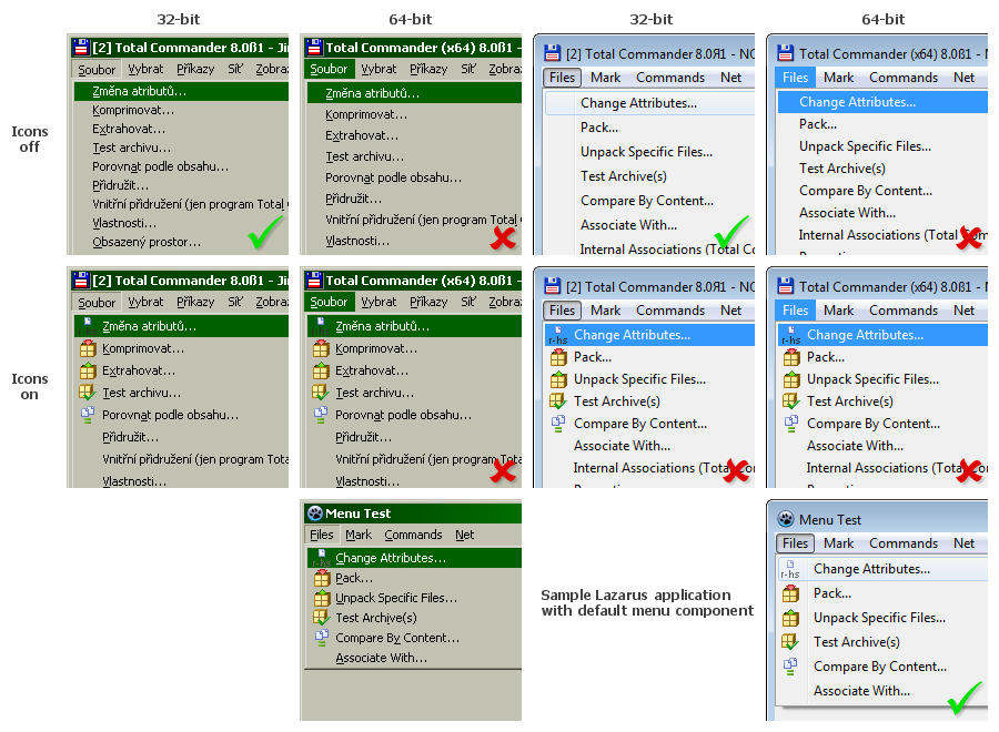
Image: http://web.hisoftware.cz/sob/img/tc80b1-menu.png
I think that picture says all. TC uses self-drawn menus and they look wrong everywhere. With classic theme it's just the background under active item on menubar. With Aero it's the whole menu that just doesn't fit with rest of the system. Look at bottom right picture how nice it could (and should) look with Aero. I use classic theme myself and I must admit that I like better how 32-bit TC draws it (2px extra for line height) compared to my Lazarus test app, but I could live with that. :)
I guess self-drawn menus were needed for older systems because they didn't support icons natively if I'm not mistaken. But would it be too hard to add some runtime check and use native menus for newer systems? For 64-bit version it could be hardcoded, as we do not have to worry about 64-bit Windows 95. :)
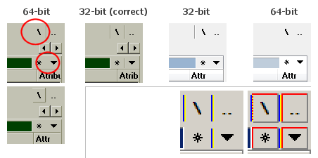
Image: http://web.hisoftware.cz/sob/img/tc80b1-visual-bugs.png
a) Only 32-bit version with classic theme has it correct. Different button separators are cut off in others. Moved to Some separators missing in main window.
b) Plus buttons in classic theme (Windows 7 x64) just don't look right, even smaller ones in 32-bit version are too big. No problems with Aero where different symbols are used. In Windows XP with classic theme it's also ok. Fixed elsewhere.
--
You know how you see all those do or don't do this or that notices and think they're not for you, because you of course know all that and don't need to be reminded? Like post only one bug report per thread. And then you catch yourself doing the opposite of what you should be doing? Happens to me sometimes... ;)
Menus and other things that don't look right
Moderators: Hacker, petermad, Stefan2, white
Menus and other things that don't look right
Last edited by Sob on 2011-09-30, 19:16 UTC, edited 1 time in total.

Follow-up: Menus and other things that don't look right
I do confirm that there are some negligences in the interface (see the post above). The huge boxes for nodes in the file tree look especially disappointing and make the whole navigation a bit problematic. Hoping that the author will correct this in the next beta.

Menus and other things that dont look right
I dont understand the choices...
only thing I can recommend is.. if you want to run a LARGE hub you should be on linux.. because your problems are probably Windows and not Yhub
I could be wrong
only thing I can recommend is.. if you want to run a LARGE hub you should be on linux.. because your problems are probably Windows and not Yhub
I could be wrong
-
ghisler(Author)

- Site Admin

- Posts: 50479
- Joined: 2003-02-04, 09:46 UTC
- Location: Switzerland
- Contact:
It's very strange because Lazarus always uses owner-drawn menus. 
Author of Total Commander
https://www.ghisler.com
https://www.ghisler.com
I didn't do anything special. I wanted to try it myself, to see if there's any point complaining or if it's how Lazarus does that and nothing can be done about it.
So I just downloaded and installed lazarus-0.9.30-fpc-2.4.2-win64.exe, created new project with TMainMenu linked with TImageList and I liked the result. :)
So I just downloaded and installed lazarus-0.9.30-fpc-2.4.2-win64.exe, created new project with TMainMenu linked with TImageList and I liked the result. :)
I examined it again and you're right. TMainMenu which I used is actually owner-drawn too and some small differences from native menus can be seen with classic theme (*1).
But still it looks quite different compared to menu currently in TC x64 and it's much closer to native look, i.e. better.
--
(*1) Most noticeable are disabled items using only one text color, while native menus use two to create "engraved" effect. And on main menubar, when item is selected, the "pressed" effect makes text move 1px right and 1px down with native menu, while Lazarus menu moves only 1px right. Not that it would be too hard to fix both, my quick'n'dirty test if it's possible took few lines of code and 20 minutes of mostly searching where to put it. A little polishing and it would be perfect. But then there's the hard part, how to persuade either Lazarus developers or you to accept the modifications. :)
-
ghisler(Author)
- Site Admin
- Posts: 50479
- Joined: 2003-02-04, 09:46 UTC
- Location: Switzerland
- Contact:
I will let Lazarus draw the main menu bar in the next beta. I only had to do it myself for languages with a different code page, e.g. Chinese, because the Delphi menu wasn't Unicode-capable.
Author of Total Commander
https://www.ghisler.com
https://www.ghisler.com
As a fan of Classic theme, I can't complain about the change in beta 2. But my idea was to let Lazarus draw the whole menu, not just the main menubar. That way TC would fit nicely with all Windows themes.
I checked several random themes downloaded from internet and except the small bug with cut off captions mentioned in Themes in menu bar (Beta 2) thread, themed menus drawn by Lazarus seem to work very well. Even better than the basic non-themed Classic style, actually. But I'd be happy to share few patches for that (but it depends how exactly are you going to handle optional menu themes off from linked thread).
I checked several random themes downloaded from internet and except the small bug with cut off captions mentioned in Themes in menu bar (Beta 2) thread, themed menus drawn by Lazarus seem to work very well. Even better than the basic non-themed Classic style, actually. But I'd be happy to share few patches for that (but it depends how exactly are you going to handle optional menu themes off from linked thread).
-
ghisler(Author)
- Site Admin
- Posts: 50479
- Joined: 2003-02-04, 09:46 UTC
- Location: Switzerland
- Contact:
I have to draw the dropdown menus myself, otherwise I couldn't support all the various options in Configuration - Options - Icons, like the 3d border around icons, or the separate checkmarks.
Author of Total Commander
https://www.ghisler.com
https://www.ghisler.com
That's right, Lazarus doesn't seem to offer much in this regard, just combined icons and checkmarks and that's it. I personally don't think that ditching 3d icon borders and separate checkmarks would be great loss, but can't speak for everyone of course. I'm pretty sure there are people who like it and I also know how it sucks when software authors decide to drop some "unused" feature and it's actually some of those I like.
On the other hand, it looks a little strange that main TC window has different menus than Lister and it's the same application.
On the other hand, it looks a little strange that main TC window has different menus than Lister and it's the same application.
-
ghisler(Author)
- Site Admin
- Posts: 50479
- Joined: 2003-02-04, 09:46 UTC
- Location: Switzerland
- Contact:
Ok, too bad for theme lovers. ;)
But if we settle for just good looking menubar, beta 3 broke it for Classic theme again (by fixing Themes in menu bar (Beta 2)). Your selected item has just different background (see image in the first post, second column), while correct Classic menus use "pressed" items (sunken frame and text offset +1px both horizontally and vertically; see first column in image, where 32-bit TC draws it correctly).
I see two possible solutions:
a) Make it same as it is in 32-bit TC when themes are disabled (don't differentiate if they are disabled in Windows or just TC)
b) In case someone already found current drawing as his favourite, keep it when themes are disabled in TC, but use correct drawing when themes are disabled in Windows, i.e. understand Windows XP theme background (menu+all bars) checkbox as more general "user wants as native look as possible".
-
ghisler(Author)
- Site Admin
- Posts: 50479
- Joined: 2003-02-04, 09:46 UTC
- Location: Switzerland
- Contact:
This is unfortunately not feasible. 32-bit lets Windows draw the menu, but Lazarus can't do that because it can't store 16-bit Unicode names in menu.a) Make it same as it is in 32-bit TC when themes are disabled (don't differentiate if they are disabled in Windows or just TC)
Author of Total Commander
https://www.ghisler.com
https://www.ghisler.com
Ok, I'll ask differently. Currently, when themes are disabled, the main menubar is drawn by TC (i.e. your own code). Is there some specific reason why you draw selected and hovered items using simply different background, instead of usual 3D style (sunked edge for selected and raised edge for hovered items)?
In case it's because traditional 3D drawing would look too different when user has themes enabled in Windows, but disabled in TC, could it perhaps be changed to depend on SystemParametersInfo(SPI_GETFLATMENU)? It's false for Classic theme in all Windows versions and true for XP and Vista+ themes.
In case it's because traditional 3D drawing would look too different when user has themes enabled in Windows, but disabled in TC, could it perhaps be changed to depend on SystemParametersInfo(SPI_GETFLATMENU)? It's false for Classic theme in all Windows versions and true for XP and Vista+ themes.
-
ghisler(Author)
- Site Admin
- Posts: 50479
- Joined: 2003-02-04, 09:46 UTC
- Location: Switzerland
- Contact:
Because I have no idea how the different Windows versions draws it - I really don't have the time to check this in all versions (and it doesn't seem to be documented anywhere either).Is there some specific reason why you draw selected and hovered items using simply different background, instead of usual 3D style
Author of Total Commander
https://www.ghisler.com
https://www.ghisler.com